Colour Charts & Metadata on the Moon
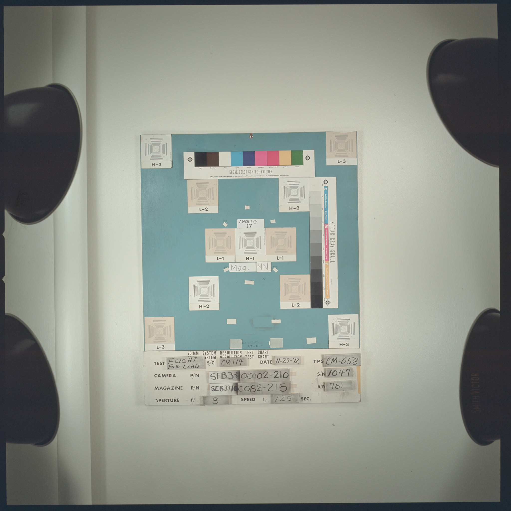 |
| as17-148-chart: Apollo 17 Hasselblad image from film magazine 148/NN - Earth, LM Inspection, Orbital |
One of the nice things to see from an imaging point of view are the early colour and photographic calibration charts.
Why are these important?
Well, they allow the images taken to be compared, adjusted and/or measured to a known source state. These colour patches and the grey ones to the right have exact known colour values. This means that the colour produced by that film stock, on that day, in those light conditions, can be compared to an exact source value - it's called benchmarking. The patches with many lines are also there to enable the photographer to calibrate for focus and allows us to clearly interpret relative crispness of focus across the scene.And then there's the data at the bottom of the patch about the flight, date, the camera, the film and camera settings. This is all useful metadata to understand the images that were taken, how they were taken and thus helping us to make those images findable and usable.
Here's some more charts I found.
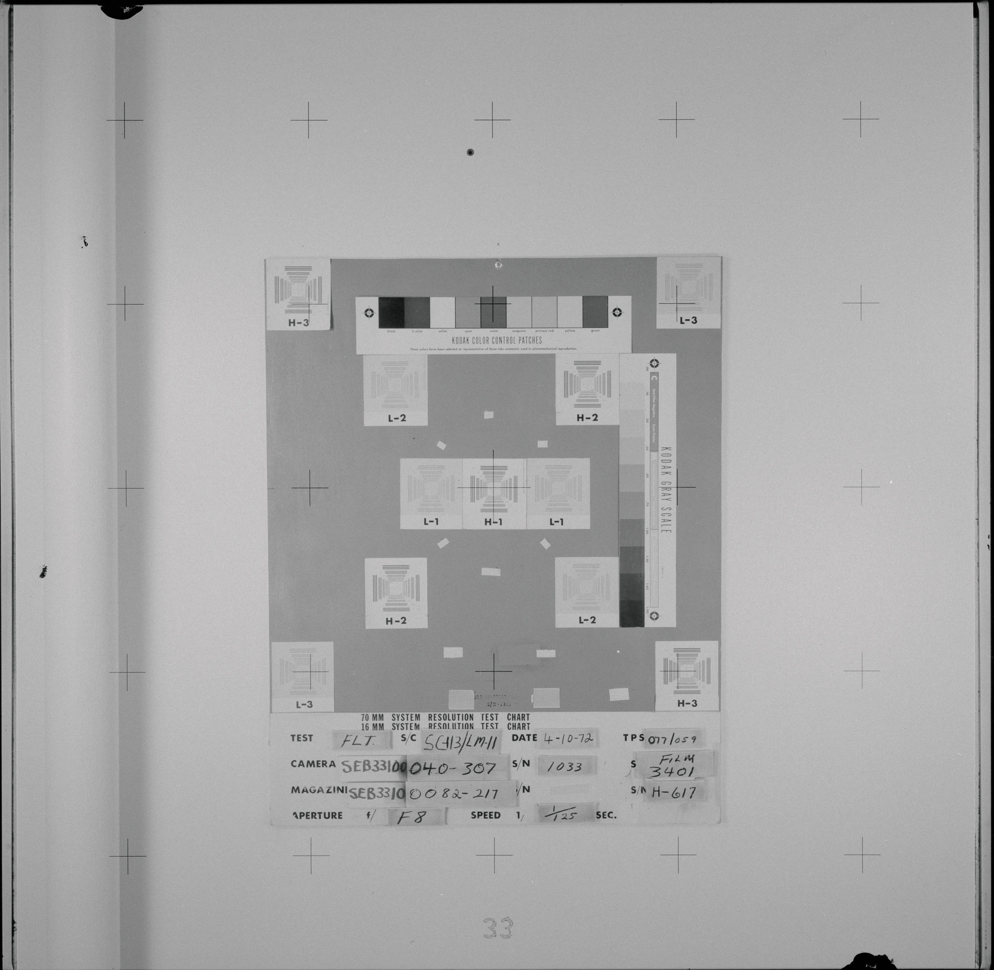 |
| as16-110-chart Apollo 16 Hasselblad image from film magazine 110/H - EVA-2 |
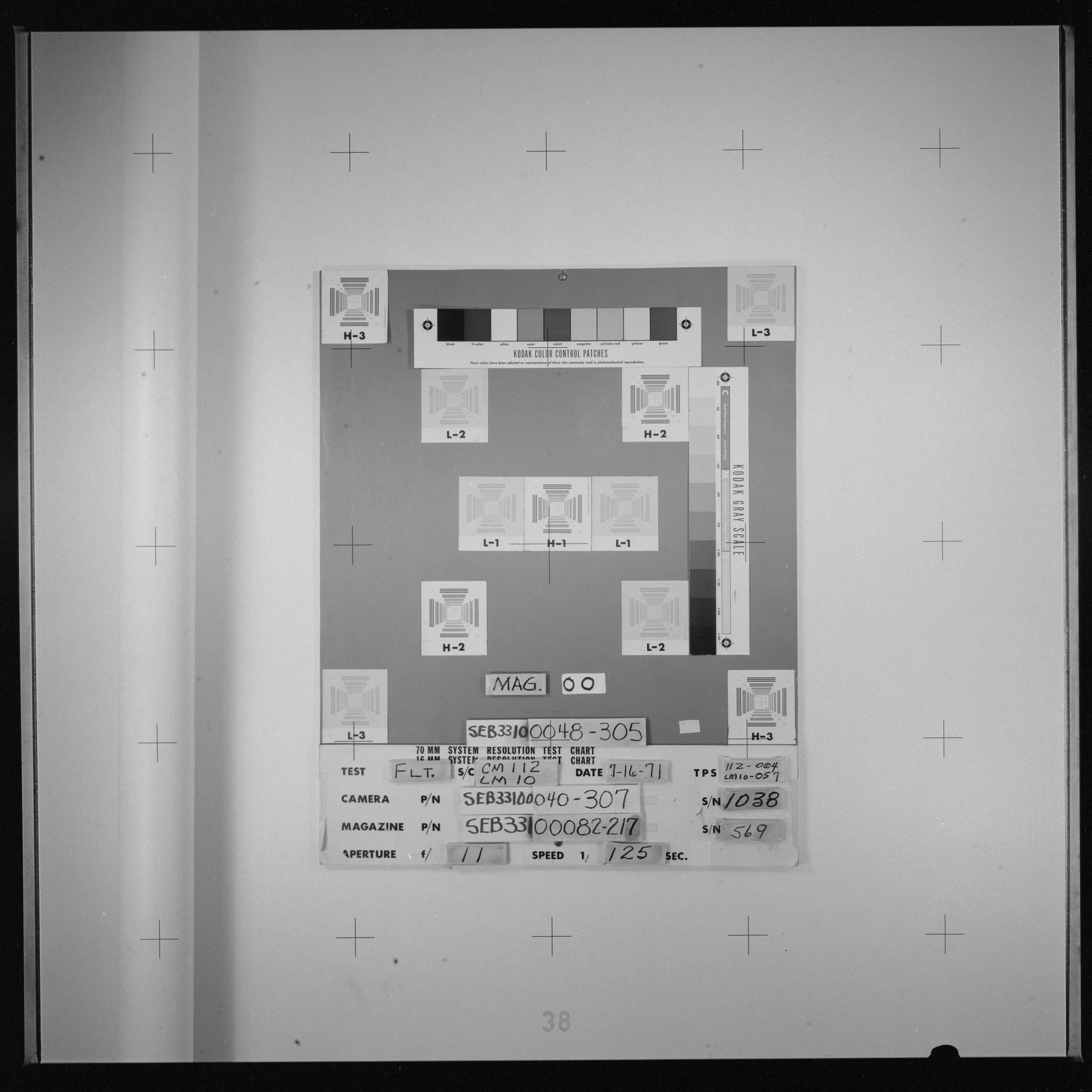 |
| as15-92-chart Apollo 15 Hasselblad image from film magazine 92/OO - EVA-2 |
 |
| AS14-68-chart Apollo 14 Magazine 68/MM chart |


Comments
Post a Comment